Insider Tips from an Interior Designer: Recreate the Looks from the Tower Oaks Model Homes
July 15th, 2020
When searching for inspiring interior designs online, it can seem like you need to start from scratch to achieve the look you want, but that isn't necessarily the case. When designing the three new model homes at Tower Oaks, our interior designers from Carlyn & Company Interiors + Design drew from furniture, artwork, and accessories from previous EYA model homes to create new designs, repurposing and reorganizing for a fresh look and perspective. Similar to homeowners moving to a new space, they took stock of items they had and worked to put together cohesive model home designs, each with a different theme throughout.
Schedule your Private Model Home Tour at Tower Oaks
We spoke with President and Co-founder of Carlyn & Company Interiors + Design, Holly Polgreen, for tips & tricks on how to get the looks from the model homes in your own home as well as how to think differently about pieces you already own.
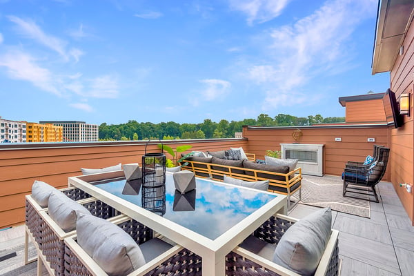
The Bailey Loft & Rooftop Terrace
Comfortable, Graphic, & Colorful
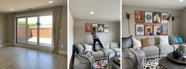
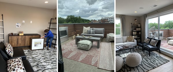
Before:
After:
How would you describe the design aesthetic of the Bailey’s loft & rooftop terrace spaces?
A comfy, graphic, and colorful hangout space.
What are your favorite details of this space?
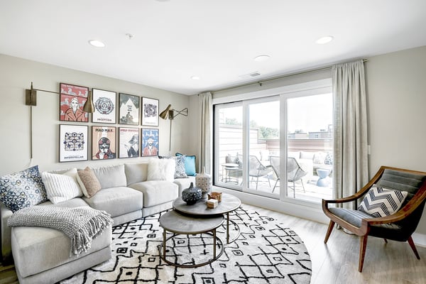
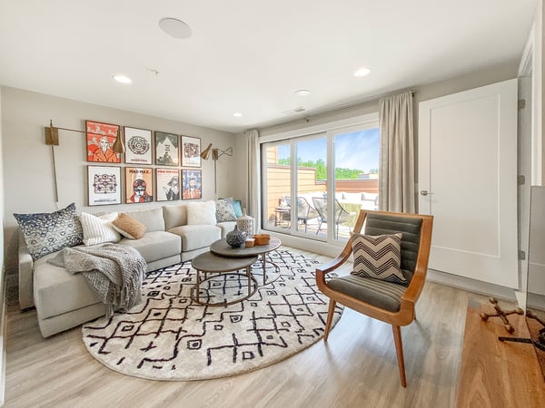
The art series over the sectional, for its whimsically modern take on movie posters.
Were there any unexpected pieces that ended up in this space?
Here, we only updated the rug, since this look we had put together at a previous community and felt it fit with the vibe we were going for here in the Bailey.
When moving into a new home, a great way to punch up the design is to add a new area rug. Rugs work best when they are sized specifically for a space, if a rug is too small or too large, it makes the room feel out of proportion. Here we used a round rug to keep the area by the terrace door open and easier to maintain long term, while the jazzy pattern and round shape create visual interest. Adding this large-scale graphic pattern to the floor balances the artwork and is a nice contrast in scale.
What would you say is the focal point of this room? How should people go about choosing the focal point of a room in their own designs?
The artwork here takes center stage! The key here is to use artwork that when put together, is close in size to the furniture below it. Here, we added two architectural hanging lamps to add width and dimension to the focal wall. A common mistake is using art that is too small or hanging it too high.
If you do not like the symmetrical aspect of a series of art, or only have small pieces to work with, try a gallery wall composed of family photos, a collection of mismatched artwork, found 3D objects, or a combination of all these things.
Another easy update when moving to a new home is changing out the hardware on a treasured piece of furniture. Today there are so many wonderful warm metals to choose from and this simple switch can take a piece from boring, to fabulous!
Was there a driving theme or design aesthetic behind both the loft and rooftop terrace designs?
Versatility! The sectional sofa spans the entire focal wall to maximize the space, for both lounging, and entertaining larger groups.
Use mid to large scale pieces in a room to anchor the space and avoid using small pieces of furniture, which can make the room appear cluttered.
For the rooftop terrace, how did you create a space that promotes relaxation as well as making it a space for entertaining?
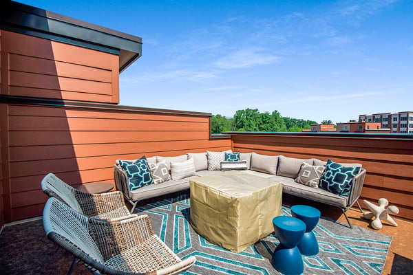
We created zones within the space that can be used for small or large groups. When moving from the loft to the rooftop terrace, or moving through any connecting spaces, keep the color palette consistent inside and out. Use variations of the palette to visually connect the two spaces.
For someone trying to achieve this look, what advice would you give them?
Start by anchoring your space with a rug that is scaled to your room. Try a modern pattern, but remember to keep the other patterns in the room either larger, or smaller in scale. These variations keep the patterns from competing and make the room more interesting.
Keep larger pieces neutral with subtle pops of color in the pillows and accessories. Then add in artwork expressing your personality or interests for color.
Tips from an Interior Designer: How to Repurpose, Redesign, & Reorganize Your Home
The Carter Loft & Rooftop Terrace
Cozy, Earthy, & Natural
Before:
After:
How would you describe the design aesthetic of the Carter’s loft & rooftop terrace spaces?
A cozy, earthy, natural vibe.
What are your favorite details of this space?
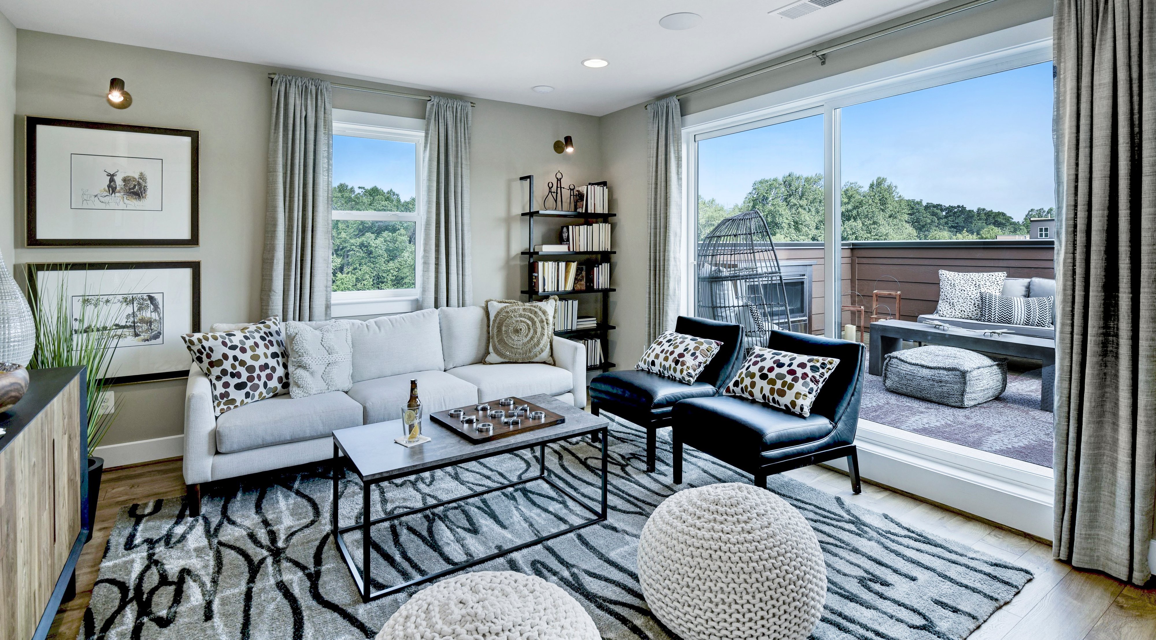
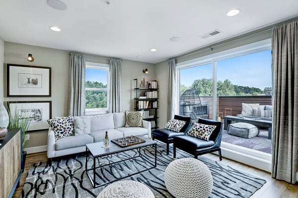
Forgo traditional end tables flanking the sofa, and go vertical with your space. Try shelving units right and left for extra storage to display books and collections. Add a light fixture above the bookcase and you eliminate the need for lamps - instant drama!
Were there any unexpected pieces that ended up in this space?
We mixed a sofa from one space with chairs from another, to create this cozy oasis, juxtaposing dark leather chairs with a bright white sofa to create a warm and inviting contrast to the space.
When deciding how to lay out your new home, think of each furniture piece individually - mix it up! Try not to fall back on putting things together as you did before, breathe new life into your home by trying new combinations for your furniture. Try an antique dresser from a bedroom as the foyer table for extra storage, or a dining console as your television piece in the loft.
What would you say is the focal point of this room? How should people go about choosing the focal point of a room in their own designs?
If you have an interesting architectural detail, you have a natural focal point for your room. If not, create one with furniture, artwork, or lamps. Here, we highlighted the window with bookshelves flanking right and left of the sofa. Adding the down light above the shelf draws your eye up, creating an eye-catching focal wall.
Was there a driving theme or design aesthetic behind both the loft and rooftop terrace designs?
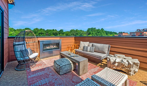
Nature. We started by using the concept of elements in nature - earth, water, fire, air, and wood. The collection of African landscape prints for the walls, an area rug with a water inspired pattern on the floor, the outdoor fireplace that naturally adds the fire element, and the furniture adds the wood element. The incredible rooftop terrace views bring the natural elements together for this nature inspired rooftop.
For the rooftop terrace, how did you create a space that promotes relaxation as well as making it a space for entertaining?
This terrace has a natural focal point in the outdoor fireplace. Using this as an anchor, we created cozy areas around it to hang out with friends or read a book by the fire. The cocoon-like chair is the perfect spot to nap and lounge the weekend away. Dining on this rooftop also has a twist. Try using a bench or settee to maximize your dining area, not only for meals but for entertaining. This set up can be the perfect spot for a temporary outdoor home office on a cool afternoon or early evening Zoom call.
For someone trying to achieve this look, what advice would you give them?
Use mother nature as a guide. If you pull color and pattern from nature you can never go wrong!
New Modern Townhomes in Rockville, MD
The Drake Loft & Rooftop Terrace
Contemporary, Sophisticated & Relaxing
Before:
After:
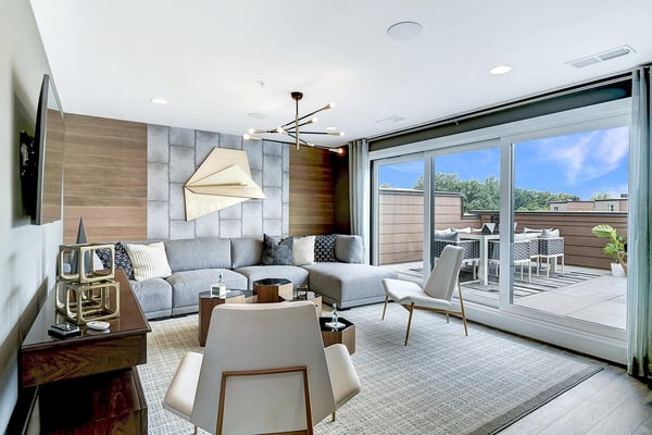
For the Drake model home, the loft design is actually the winning design from our Interior Design Throwdown. This concept, Contemporary Cool, won by a landslide.
How would you describe the design aesthetic of the Drake's loft & rooftop terrace spaces?
A balance of subtle and sophisticated details, incorporating clean lines, textures, and pops of interest.
What are your favorite details of this space?
Go beyond adding furniture - think about treating walls, floors, and ceilings. Here, the combination of Stikwood (a DIY wood product that can be adhered to any wall) and a stone-like wall covering create a play on vertical and horizontal lines. This mixing of textures with a subtle neutral palette adds instant wow to our contemporary cool focal wall.
Were there any unexpected pieces that ended up in this space?
We added large scale dimensional art in a contrasting gold finish paired with a linear light fixture hung close to the ceiling, to further emphasize the focal wall and draw your eye up to the ceiling.
For someone trying to achieve this look, what advice would you give them?
Mix textures and natural elements. Dark colors vs. light colors, slick materials vs. textured finishes, horizontal lines vs. vertical stripes. Here, we used dramatic contrast, yet still maintained a relaxing vibe.
For more on the Contemporary Cool design seen in the Drake, click here.
Tips from an Interior Designer: Contemporary Cool
How to Get the Look in Your Own Home
ADDITIONAL TIPS FROM THE DESIGNERS
When putting together each of the lofts, did you start with one inspiration piece and build from there or start with a concept and find pieces that fit that idea?
Start with a space plan. Experiment with apps that can help you determine the best layout. Amikasa, MagicPlan, or Floor Plan Creator (among others), are design related apps that can help you with the basics. I know, it is tempting to start with look and inspiration boards, but there is little point to falling in love with a look or idea that will not fit within your space. Take the time to do the work upfront. Getting the scale and proportions correct will save you time and money in the long run.
The next step is creating a vision or look board for your room. Use this as a guide to help you curate the right pieces to achieve your vision.
When designing for adjoining spaces, how do you keep rooms visually interesting with their own personalities while still feeling cohesive and symmetrical?
Keep a visual rhythm by using shades of a similar color palette throughout each space, but mix up the scale, or value of the colors. For example, if you have an all-white kitchen in an open concept plan, add variations of white in furnishing, art, and accessories to balance the weight and scale of the kitchen. Repeating the dominant color will unify the space, drawing your eye around the room, bringing the look together.
How do you go about choosing a color palette for a room?
I would highly recommend deciding on your color palette early. This helps you stay focused when selecting furnishing for the space.
If you feel unsure in your choices, you can always start with the classic 60/30/10 rule.
- 60% should be a neutral color
- 30% should be a secondary color or texture
- 10% should be an accent color
For outdoor space, other than purposely selecting outdoor furniture when purchasing, what are some types of pieces that can withstand the elements and be outside year-round or at least for the warmer months?
Treat this space as you would any interior room. Terrace walls look fabulous with the addition of mirrors, artwork, rugs and ottomans. Just make sure to check the manufacturers specifications to be sure they are safe for year-round outdoor use.
Visit the model homes at Tower Oaks to see the loft & rooftop terrace designs in-person, as well as explore the other newly furnished levels & rooms below. Schedule an appointment for your private tour of these brand new model homes and learn more about this exciting new Rockville, MD neighborhood.
Topics:
