Give Your New Year a Fresh Start with Color
By: DanzigerDesign on January 12th, 2012
For many people, diverging from a room with almond-colored walls is the basis for major home decorating anxiety. Selecting a paint color often brings about several trips to the paint store, countless hours pouring over magazines, several patches of colors tested on the walls, and more than one sleepless night. But we have good news: Careful planning can put an end to all the stress.
Naturally, the new year brings new color predictions from the interior and fashion design worlds. We will address some our research-based predictions later, but first we want to discuss color concepts that stand the test of time.
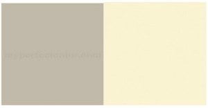
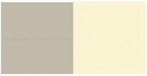
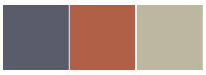
For those of you who love to showcase precious pieces of art and other treasured objects, a background color of neutral grey (like Benjamin Moore Revere Pewter HC-172) or wheat (like Farrow and Ball White Tie 2002) are great picks. Sometimes, people refer to these hues as "safe," but really they are the colors that make the beloved items pop. Throw in some eggplant with the grey or copper with the wheat color and you have a scheme that you can continue to build upon.
If you must have a trendy paint color, start small, like in a powder room. It is a smaller space and can be changed much easier than a hallway or master bedroom.
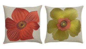
Nobody says the trendy color has to be on the walls. If your room is mostly neutral, you can bring small doses of trendy colors in with pillows, throws, and accessories. This is an option that won’t break the bank and can be changed out when you spot the next year’s trend that you can’t live without. For example, you may not want an entire room painted in the green or coral of the pillows below, but wouldn’t they look wonderful accenting a bed or a sofa? The commitment is small, but the impact is large.
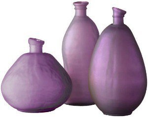
Or, you may love the color purple, but not want a “Barney”-inspired bedroom. An accent of the color may be all you need, as seen in the vases below.
If you are going to paint a room, make this small investment that will save you money in the long run: Always buy the smallest can possible (usually a pint) of a paint color that you are seriously considering and paint it on a piece of foamcore or white cardboard. This allows you to look at the color in various parts of the room without commitment. Many paint stores also have color boards that you can purchase for under $10. After all, it is a little scary to paint an entire room based on a typical 1" by 2” chip!
As promised (don’t go away- the color of the year is going to be unveiled at the end!), here are some color trends we are beginning to see with some visuals from Benjamin Moore.
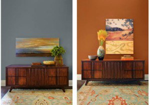
The following two pictures show the same basic room scene with two other color trends for 2012. The first wall is painted Masada AF-220 while the second is painted Montpelier AF-555. This side by side really shows the the impact that color has on a room's mood and the look of surrounding objects.
No matter what, don’t select a color just because it’s trendy. You have to like it, you have to live with it. Select colors that you like and that make you feel good.
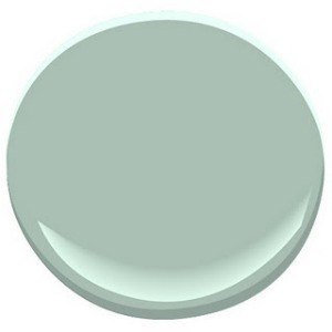
And without further ado, Benjamin Moore predicts that the color of the year for 2012 will be… Wythe Blue!
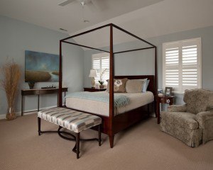
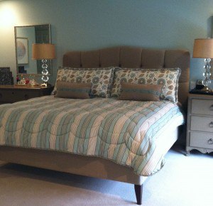
This blend of blue and green with a hint of gray is both soothing and energizing at the same time. Here are two inviting bedrooms designed by Danziger Designs using similar blue/green/gray shades of color.
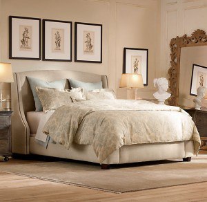
If an entire room in this color is not for you, perhaps an accent of this color with a neutral background - like that pictured here by Restoration Hardware - is more to your liking.
Whatever you decide, just keep in mind that it is only paint and it can be changed easily. Happy coloring!
This post was written by EYA’s exclusive guest blogger, Danziger Design, a Bethesda-based interior design firm. If you’re looking for professional design services, check out their portfolio of beautiful work and give them a call at 301-365-3300!
